ArcAme
Identité Visuelle
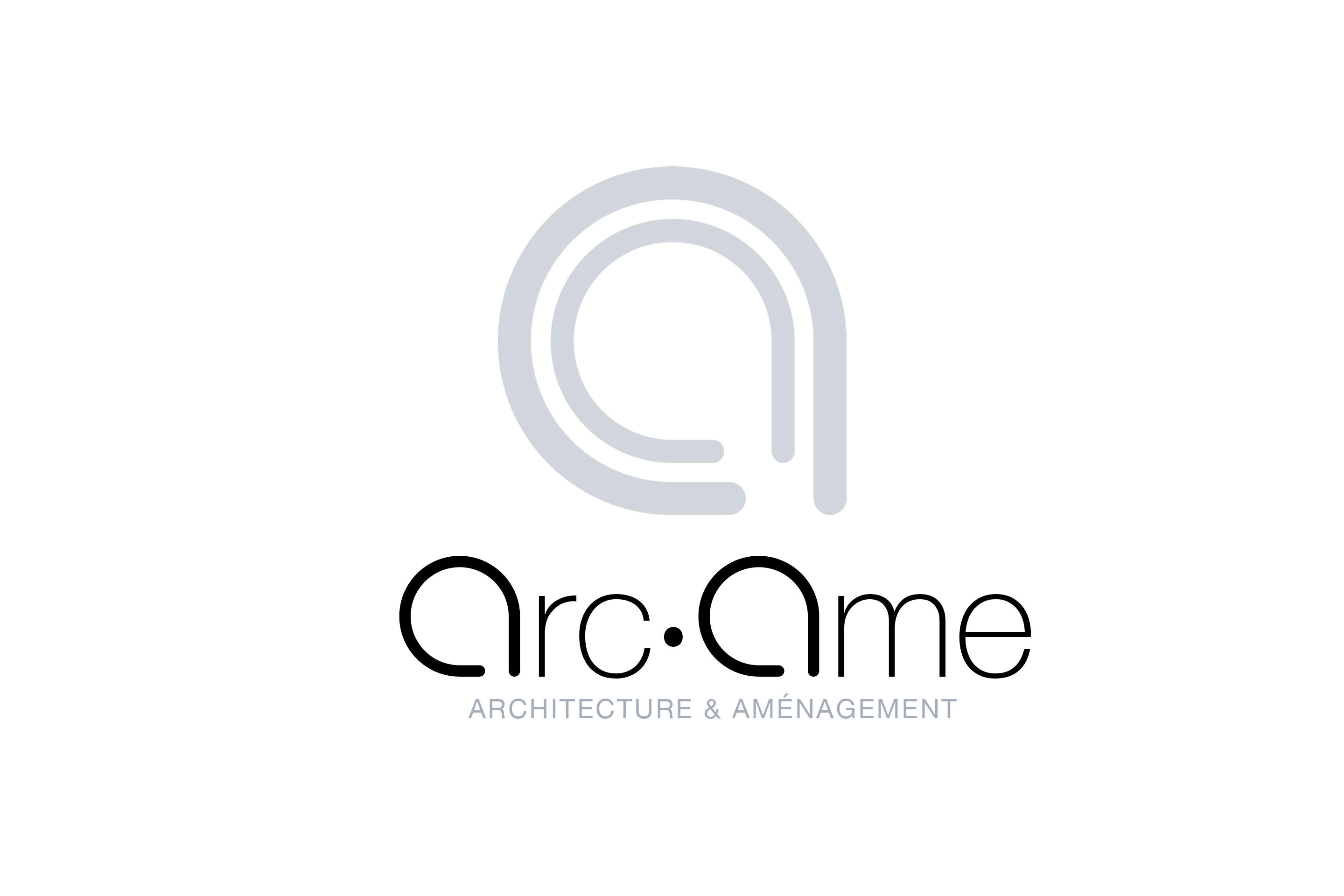
L’agence d’Architecture et d’Urbanisme ArcAme avec qui nous travaillons régulièrement nous a demandé en 2013 de redéfinir complètement son identité visuelle.
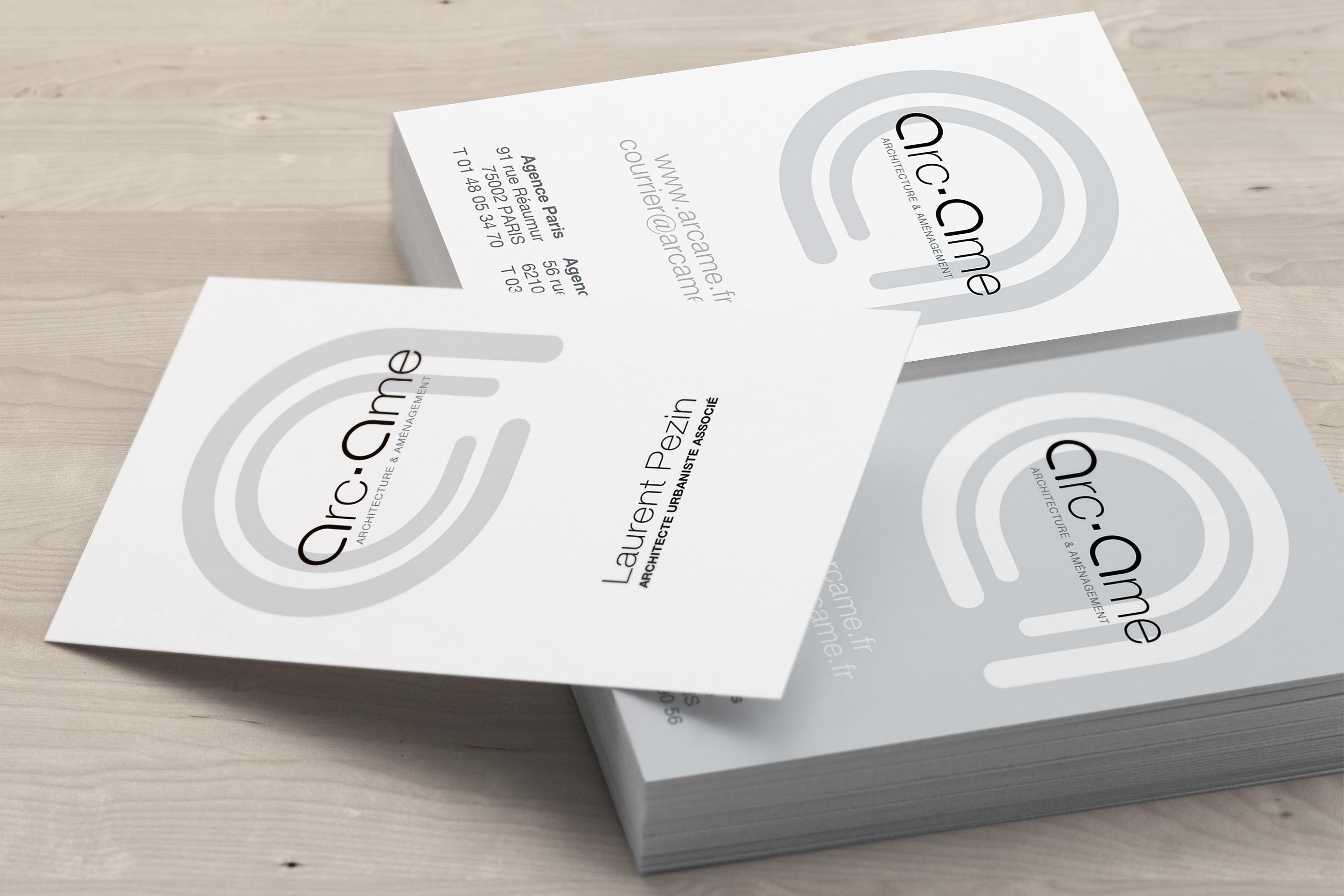
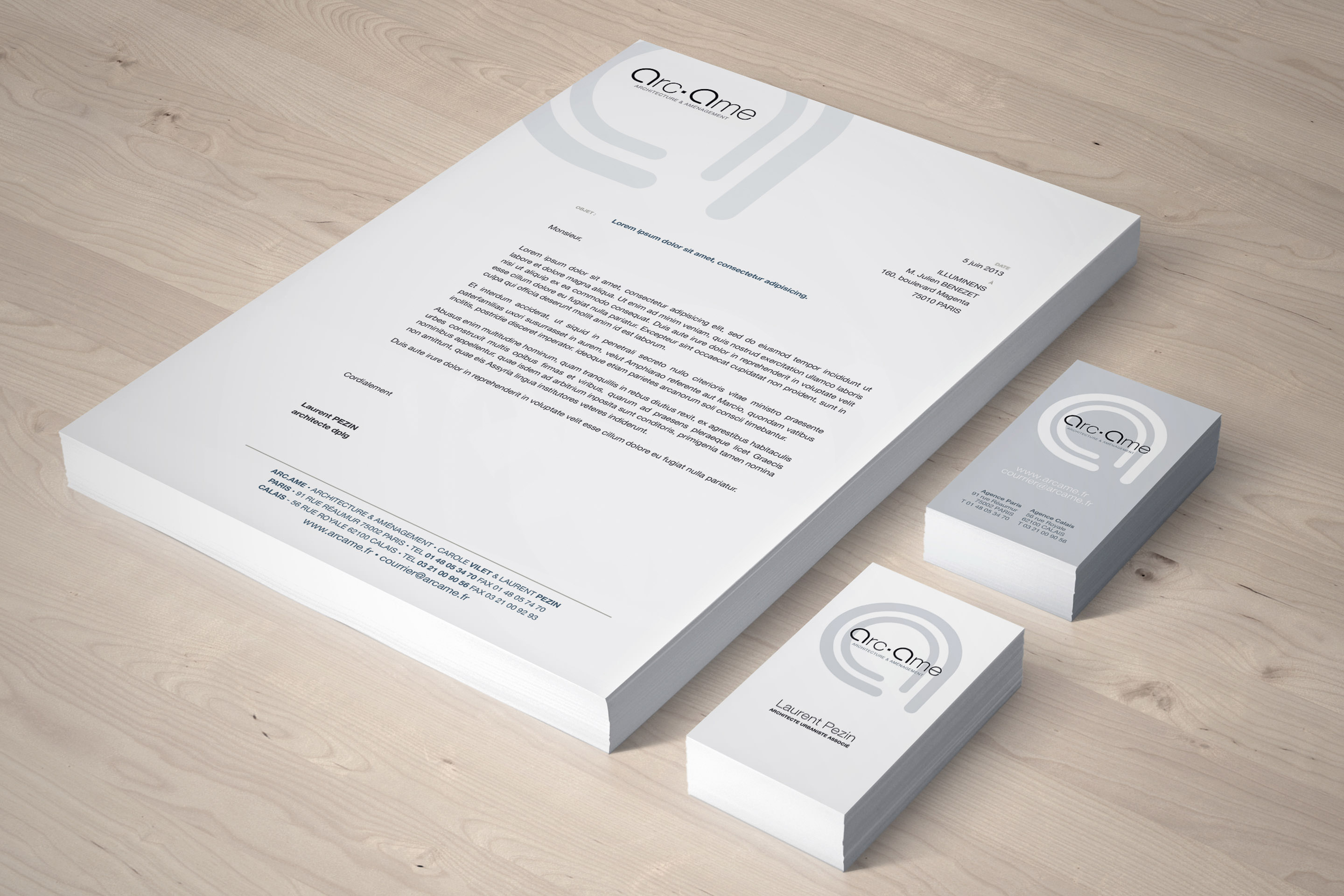
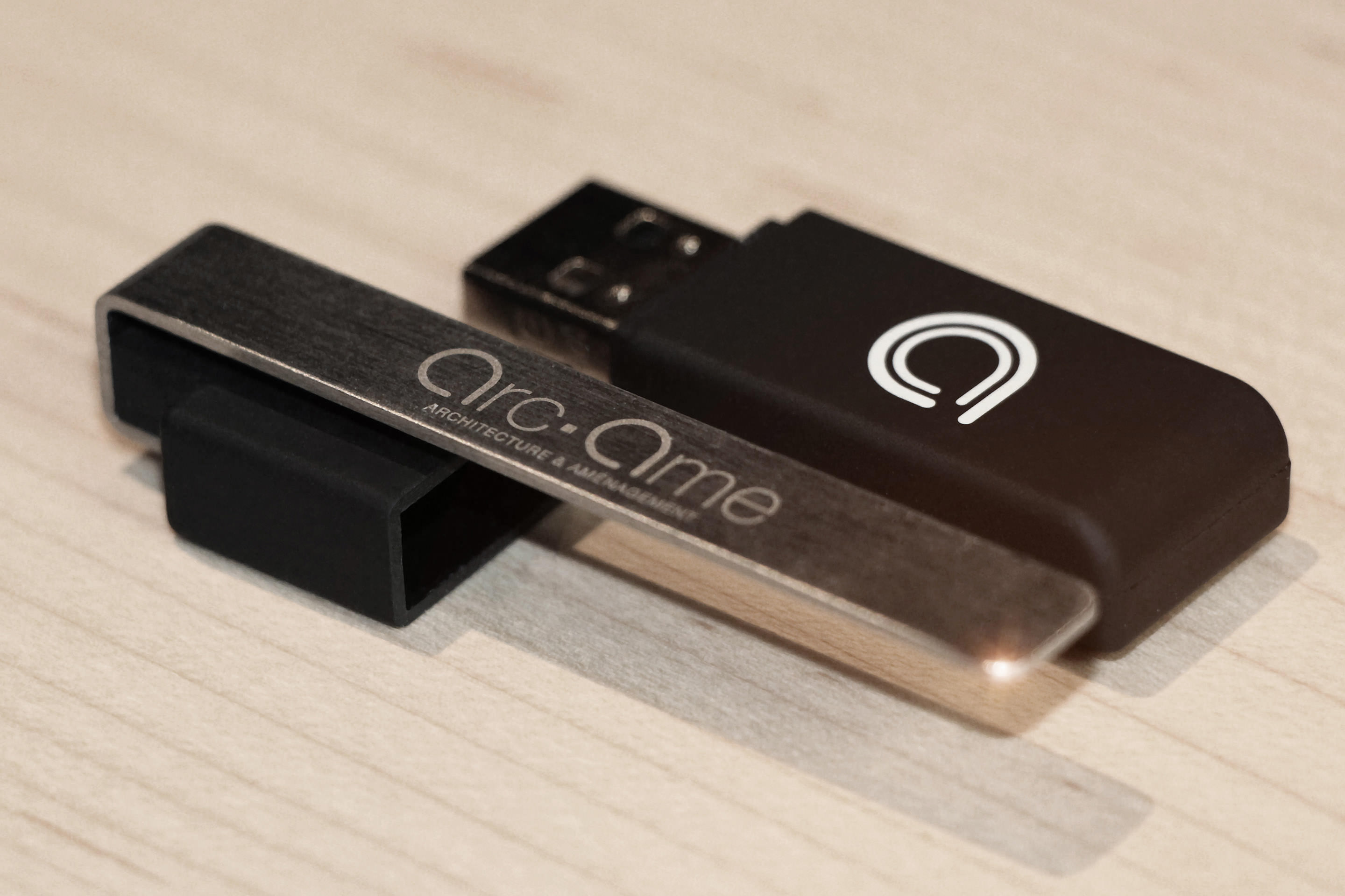
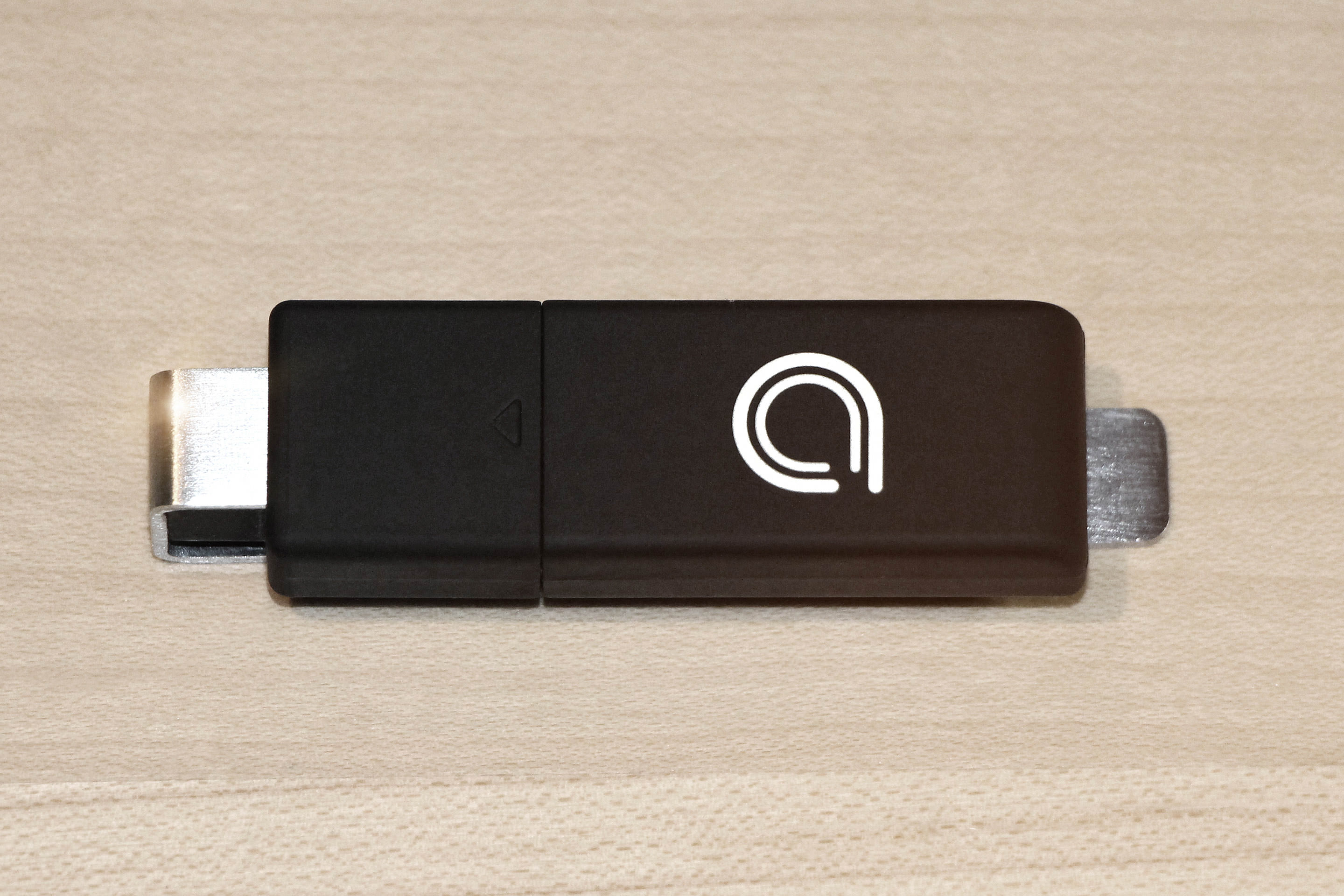
L’axe principal de réflexion fut de réfléchir parallèlement à un « pictogramme » et à un logo basé sur le nom de l’agence, et de pouvoir les fusionner ou les séparer au besoin. Il était important qu’à travers le logo, on puisse « lire » le nom de l’agence. La forme graphique des deux « A » qui s’imbriquent l’un dans l’autre dans le pictogramme évoque le parcours, le chemin et la place, mais aussi la tête pensante (de profil), la réflexion.
voir : Book de Références Arc•Ame ►
SujetIdentité VisuelleClientArcAme Année2013